
- en
Perfect-Air Labs
Perfect-Air is a startup that makes sensors to measure air quality, the concentration of various pollens, gases and also dust particles in the air around us. It mainly emphasizes the localness of the data and its relevance for each individual user.
The aim of the collaboration was to display the values from these sensors on a map of Europe together with satellite data and information from professional weather stations, so that the user gets a comprehensive overview of the current state of air quality and friendliness.
area
Ecology
client
Perfect-Air Labs s.r.o.
system
Web, Mobile
Challenge
A major challenge of the implementation was to find quality data sources that would complement the Perfect-Air sensors and provide data at sufficient density to create a heatmap. At the beginning of the project, the client itself did not know which sources it would use.
The different data sources also needed to be combined appropriately. Specifically, we had to figure out how to interpolate regular dense and irregular sparse data at different points in time, and create the desired heatmap for each of those points in time. For such a large amount of data, we needed to establish a reliable repository and a system on top of it that would work with it and make the data available to the web and mobile application at the same time.

It was also necessary to figure out how to process and display large amounts of data quickly and efficiently in both applications, even when the user is working with zoom or across time. The applications had to be graphically consistent and allow interaction with the map in a similar way, despite the different systems and screen sizes.
Another nut that required a unique solution was the air quality assessment for allergy sufferers. This meant answering the question of how to easily visualize whether or not allergy sufferers could safely go outside.
The Problem
The problem was to visualise the air quality (dust and pollen) so that it was clear and easy to understand and navigate. Another challenge was to ensure that the data was available at every location where the user is - i.e. even outside the area covered by the measuring stations.
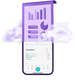
Perfect-Air needed to create a web app and, most importantly, a mobile app that the user would always have to hand. The main part of these apps was to be a heatmap that would show the different aspects of air quality not only in the present, but also offer a glimpse into the past and the near future.
Previous solutions and frequent competitors' variants only showed on the map the point values of sensors, of which there are only a few dozen across Europe. In addition, they only provided data on dust particle concentrations, while they could not measure pollen and gas data. In addition, they also only showed the current status, which was a significant limitation. In other words, sensor data alone was not sufficient.
Challenge
A major challenge of the implementation was to find quality data sources that would complement the Perfect-Air sensors and provide data at sufficient density to create a heatmap. At the beginning of the project, the client itself did not know which sources it would use.
The different data sources also needed to be combined appropriately. Specifically, we had to figure out how to interpolate regular dense and irregular sparse data at different points in time, and create the desired heatmap for each of those points in time. For such a large amount of data, we needed to establish a reliable repository and a system on top of it that would work with it and make the data available to the web and mobile application at the same time.
It was also necessary to figure out how to process and display the large volume of data quickly and efficiently in both applications, even when the user was zooming or working across time, for example. The apps had to be graphically consistent and allow interaction with the map in a similar way, despite the different systems and screen sizes.
Another nut that required a unique solution was the air quality assessment for allergy sufferers. This meant answering the question of how to easily visualize whether or not allergy sufferers could safely go outside.
Solution
First demo, then resource implementation analysis, technology change and finally product
In a very short period of time (3 weeks) we managed to create the main parts of the demo application, i.e. a sample heatmap that interpolated readily available open source data. In addition to the Perfect-Air sensor data, we added two sources of dust particle data from ground sensors - namely the Czech Hydrometeorological Institute, which has the most relevant data on the territory of the Czech Republic, and the OpenAQ service, which provides the same quality of data outside the reach of the Czech Hydrometeorological Institute.
The client thus gained a functional application on which to validate user requirements, user testing, and last but not least, a demonstration for investors to obtain subsidies for further development.
We used our mainstream technologies Node.js and React.js to create the demo.
Once the demo was complete and the business requirements were clarified, we proceeded to further develop the application, primarily getting relevant data for locations outside of the measurement stations. Here we were faced with a problem regarding the acquisition of dust, gas and pollen particle data. We had to find worldwide sources with affordable pricing and data relevance. The choice fell on data from the CAMS service operated by the European Space Agency ESA under the Copernicus programme. This provided us with the required quality and density of the heatmap, while making the satellite data available on a grid density of only a few kilometres. This included historical data as well as current and predicted data. Adequate storage and archiving processes then had to be established for data of this size.
Subsequently, we found that the javascript technologies used so far were not the best choice for automated retrieval and processing of meteorological data in binary systems. Therefore, we found a more efficient solution - we changed the stack to Python and C#, which are more suitable for heavy mathematical computations. Thanks to this, we managed to automate data downloading and parsing it into the necessary data and displaying it on a map.
Copernicus, as our main source, provides data in a format that is not supported by many modern programming languages. Of the available options, we chose Python, which has extensive support for mathematical and geographic operations. It was these that were necessary for interpolating and georeferencing the data for the heatmap. We decided to separate the data downloads from each source and combine them into independent "modules" that would communicate with only one common system - the backend cloud application, which we decided to write in C#. This backend should also provide data to the web and mobile application.
We decided to write the web app in the React framework and the mobile app in React Native, which supports both iOS and Android development. The similarity of the two frameworks allowed us to share large chunks of code across both apps, and UI/UX consistency was maintained. We implemented the interactive heatmap using the Mapbox GL library, which uses standard protocols such as Mercator's mesh view for rendering.

Process
The project was unique not only in its technological complexity regarding data acquisition and processing, but also in the way and time of implementation.
The client first obtained a working demo application so that they could secure funding. This was successful for a sufficient, but limited, period of time. We spent a large part of the project on the research and prototyping part, which had a high level of complexity and ultimately required changing technology and other elements.
Once the prototyping part was completed and connected to data sources, we were 100% confident of the project's feasibility. Within the remaining budget and timeframe, we maximized the utility and complexity of each functionality, and those with the greatest benefit were completed on schedule.
Technologies
React.js, React Native
AWS, MongoDB, Python
Result
The resulting solution consists of a mobile app, a web app, and an API endpoint system to which other systems can connect. We can also provide data for this system - either all or only selected data.
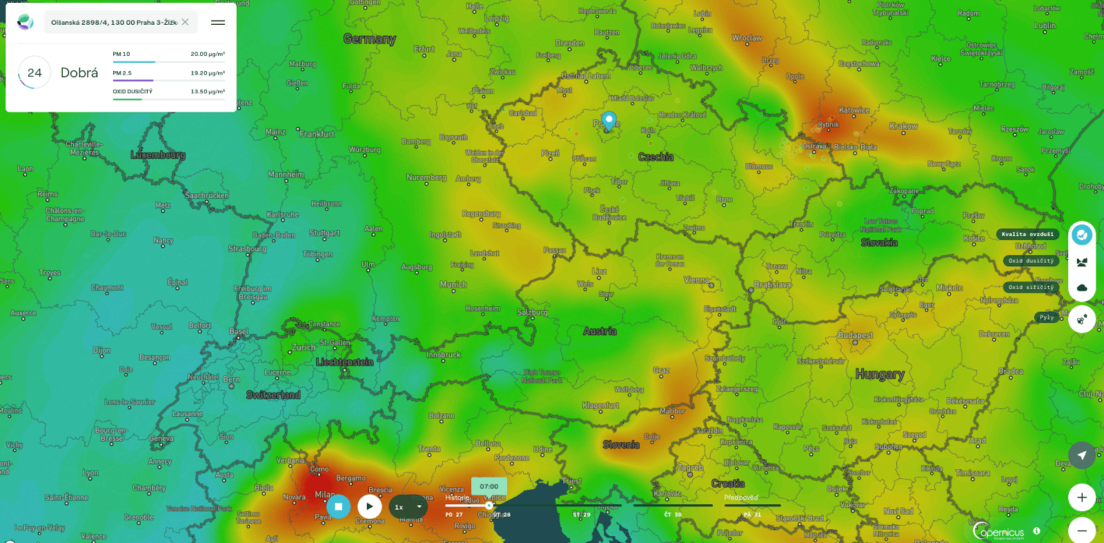
The resulting apps contain nine different heatmaps divided into two groups - air quality and pollen. Within air quality, there are heatmaps for the air pollution index (CAQI), sulphur dioxide and nitrogen dioxide. In the pollen group, heatmaps of pollen index, birch, alder, wormwood, grass and ragweed can be found. All these heatmaps can be viewed by the user in an animated timeline, several days back and several hours forward. Clicking on any location on the map will display information about the various components of air pollution in that location, including forecasts and health advisories for current values.
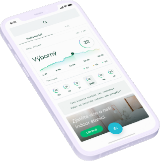
The CAQI map combines satellite data with ground sensor data. Perfect Air displays the sensors as colored points on the map that can be clicked on to see detailed measurement information. In the mobile and web app, the current user location on the map is displayed as a matter of course. In addition to the usual settings such as language localization, dark mode or personal default settings, the mobile app also allows you to save your favorite locations for which it displays quality reports.
Maps are updated hourly based on new data from data sources that are continuously downloaded, combined and saved. This data is then provided via a REST API to both client applications, ready for resale to third parties.


Copyright © 2024 All rights reserved